(watch section) (read the wiki)
Imports
- numpy, pylab and matplotlib provide a number of functions to Python that give it MATLAB-like capabilities.
- datetime helps us manipulate dates.
- The qstkutil items are from the QuantSoftware ToolKit
Input:
    import QSTK.qstkutil.qsdateutil as du
    import QSTK.qstkutil.tsutil as tsu
    import QSTK.qstkutil.DataAccess as da

    import datetime as dt
    import matplotlib.pyplot as plt
    import pandas as pd
Some notebook magic, please ignore
Input:
%matplotlib inlineSome symbols and dates
We’ll be using historical adjusted close data. QSTK has a DataAccess class designed to quickly read this data into pandas DataFrame object. We must first select which symbols we’re interested in, and for which time periods. Note that the wiki tutorial script uses 2006, but in the video tutorial, we use 2010. The end date differs to so as we have 2 weeks of data. SPX is the S&P 500.
Input:
    ls_symbols = ["AAPL", "GLD", "GOOG", "$SPX", "XOM"]
    dt_start = dt.datetime(2010, 1, 1)
    dt_end = dt.datetime(2010, 1, 15)
The time at which the market closes is 16:00.
Input:
dt_timeofday = dt.timedelta(hours=16)The function getNYSEdays(dt_start, dt_end, dt_timeofday) returns the days
of the interval for which the New York stock exchange was open. It adds the
time of day given as param to each datetime member of the result list.
Input:
ldt_timestamps = du.getNYSEdays(dt_start, dt_end, dt_timeofday)Input:
ldt_timestampsOutput:
[Timestamp(‘2010-01-04 16:00:00’, tz=None),
Timestamp(‘2010-01-05 16:00:00’, tz=None),
Timestamp(‘2010-01-06 16:00:00’, tz=None),
Timestamp(‘2010-01-07 16:00:00’, tz=None),
Timestamp(‘2010-01-08 16:00:00’, tz=None),
Timestamp(‘2010-01-11 16:00:00’, tz=None),
Timestamp(‘2010-01-12 16:00:00’, tz=None),
Timestamp(‘2010-01-13 16:00:00’, tz=None),
Timestamp(‘2010-01-14 16:00:00’, tz=None)]
Note than Jan 4 was the first open day of the interval, and Jan 14, the last.
Data access
Create an object that will be ready to read from our Yahoo data source
Input:
c_dataobj = da.DataAccess('Yahoo')c_dataobj.get_data creates a list of dataframe objects. The dict-zipping
converts this list into a dictionary for easier access.
Input:
    ls_keys = ['open', 'high', 'low', 'close', 'volume', 'actual_close']
    ldf_data = c_dataobj.get_data(ldt_timestamps, ls_symbols, ls_keys)
    d_data = dict(zip(ls_keys, ldf_data))
Note that in the list of keys, 'close' refers to adjusted close, and
actual_close is the raw close price. Looking at the type of the object created
by get_data
Input:
ldf_data.__class__, ldf_data[1].__class__Output:
(list, pandas.core.frame.DataFrame)
Input:
d_data['close']Output:
| AAPL | GLD | GOOG | $SPX | XOM | |
|---|---|---|---|---|---|
| 2010-01-04 16:00:00 | 213.10 | 109.80 | 626.75 | 1132.99 | 64.55 |
| 2010-01-05 16:00:00 | 213.46 | 109.70 | 623.99 | 1136.52 | 64.80 |
| 2010-01-06 16:00:00 | 210.07 | 111.51 | 608.26 | 1137.14 | 65.36 |
| 2010-01-07 16:00:00 | 209.68 | 110.82 | 594.10 | 1141.69 | 65.15 |
| 2010-01-08 16:00:00 | 211.07 | 111.37 | 602.02 | 1144.98 | 64.89 |
| 2010-01-11 16:00:00 | 209.21 | 112.85 | 601.11 | 1146.98 | 65.62 |
| 2010-01-12 16:00:00 | 206.83 | 110.49 | 590.48 | 1136.22 | 65.29 |
| 2010-01-13 16:00:00 | 209.75 | 111.54 | 587.09 | 1145.68 | 65.03 |
| 2010-01-14 16:00:00 | 208.53 | 112.03 | 589.85 | 1148.46 | 65.04 |
Drawing a figure
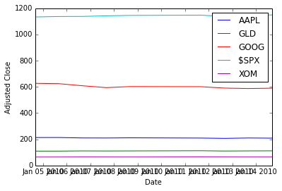
We pull the close prices we cant to plot out of the pandas dataframe, into a 2D numpy array.
Input:
na_price = d_data['close'].valuesNow, plotting with matplotlib. Here we first clear the plot (clf), plot
the data, and then modify the plot to add a legend and some labels.
Input:
    plt.clf()
    plt.plot(ldt_timestamps, na_price)
    plt.legend(ls_symbols)
    plt.ylabel('Adjusted Close')
    plt.xlabel('Date')
Output:
<matplotlib.text.Text at 0x4a9c2d0>
To save a PDF file containing the plot:
Input:
plt.savefig('adjustedclose.pdf', format='pdf')Output:
<matplotlib.figure.Figure at 0x4923310>
Data normalisation
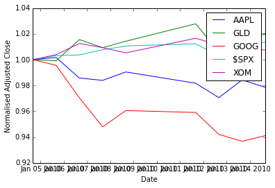
To better see the variations, we normalize the data with respect to the first day’s price (so we divide all rows by the first row).
Input:
na_normalized_price = na_price / na_price[0, :]Plotting:
Input:
    plt.clf()
    plt.plot(ldt_timestamps, na_normalized_price)
    plt.legend(ls_symbols)
    plt.ylabel('Normalised Adjusted Close')
    plt.xlabel('Date')
Output:
<matplotlib.text.Text at 0x4d04110>
Daily returns
(From here, there are no video tutorials, only the wiki)
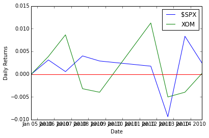
The QSTK function returnize0 computes the daily return of stocks
(remember, \(\text{ret}(t) = \frac{\text{price}(t)}{\text{price}(t-1)} -1\)).
Beware, returnize0 mutates the array. Make a copy first:
Input:
    na_rets = na_normalized_price.copy()
    tsu.returnize0(na_rets)
Output:
array([[ 0. , 0. , 0. , 0. , 0. ],
[ 0.00168935, -0.00091075, -0.00440367, 0.00311565, 0.00387297],
[-0.0158812 , 0.01649954, -0.02520874, 0.00054552, 0.00864198],
[-0.00185652, -0.00618779, -0.02327952, 0.00400127, -0.00321297],
[ 0.00662915, 0.004963 , 0.01333109, 0.00288169, -0.00399079],
[-0.00881224, 0.01328904, -0.00151158, 0.00174676, 0.01124981],
[-0.01137613, -0.02091272, -0.01768395, -0.00938116, -0.00502895],
[ 0.01411787, 0.00950312, -0.00574109, 0.00832585, -0.00398223],
[-0.00581645, 0.00439304, 0.00470115, 0.00242651, 0.00015378]])
Input:
    plt.clf()
    plt.plot(ldt_timestamps[0:50], na_rets[0:50, 3])  # $SPX 50 days
    plt.plot(ldt_timestamps[0:50], na_rets[0:50, 4])  # XOM 50 days
    plt.axhline(y=0, color='r')
    plt.legend(['$SPX', 'XOM'])
    plt.ylabel('Daily Returns')
    plt.xlabel('Date')
Output:
<matplotlib.text.Text at 0x4923a90>
Scatter plots
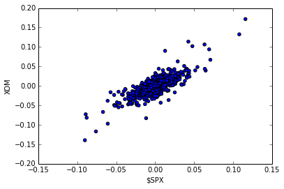
To estimate the correlation between two securities. Let’s work with more data first.
Input:
    dt_start = dt.datetime(2006, 1, 1)
    dt_end = dt.datetime(2010, 12, 31)
    ldt_timestamps = du.getNYSEdays(dt_start, dt_end, dt_timeofday)
    d_data = dict(zip(ls_keys, c_dataobj.get_data(ldt_timestamps, ls_symbols, ls_keys)))
Filling the data for NAN: we apply the filling functions in decreasing order of preference.
Input:
    for s_key in ls_keys:
        d_data[s_key] = d_data[s_key].fillna(method='ffill')
        d_data[s_key] = d_data[s_key].fillna(method='bfill')
        d_data[s_key] = d_data[s_key].fillna(1.0)
Getting the numpy ndarray of close prices.
Input:
    na_price = d_data['close'].values
    na_normalized_price = na_price / na_price[0, :]
    na_rets = na_normalized_price.copy()
    tsu.returnize0(na_rets);
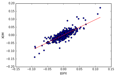
XOM vs. S&P 500:
Input:
    plt.clf()
    plt.scatter(na_rets[:, 3], na_rets[:, 4], c='blue')
    plt.ylabel('XOM')
    plt.xlabel('$SPX')
Output:
<matplotlib.text.Text at 0x4fe8850>
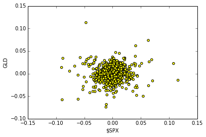
Plotting the scatter plot of daily returns between $SPX VS GLD
Input:
    plt.clf()
    plt.scatter(na_rets[:, 3], na_rets[:, 1], c='yellow')
    plt.ylabel('GLD')
    plt.xlabel('$SPX')
Output:
<matplotlib.text.Text at 0x5003f50>
QSTK Exercises
Exercise: Cumulative Daily Returns
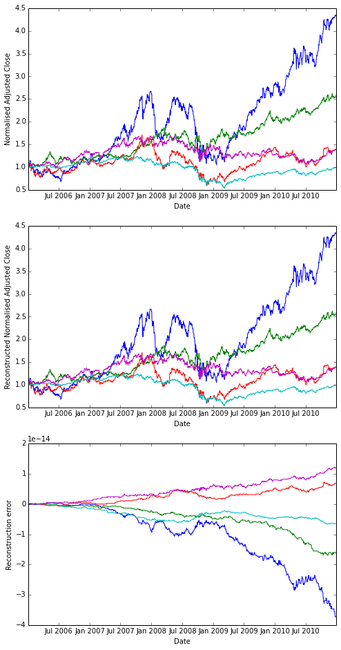
Using the daily returns we can reconstruct cumulative daily returns. Note that in general the cumulative daily return for day t is defined as follows (this is NOT Python code, it is an equation):
Input:
daily_cum_ret(t) = daily_cum_ret(t-1) * (1 + daily_ret(t))I don’t provide the code for this, as it is a programming assignment. If you plot the result, it should look exactly like the normalized returns plot above.
Answer
Input:
    import numpy as np

    def daily_cum_ret(np_arr):
        "Reconstructs the cumulative returns from daily returns."
        assert np_arr.size != 0
        dcr = np.empty_like(np_arr, dtype=float)
        dcr[0] = 1
        for ri in xrange(1, np_arr.shape[0]):
            dcr[ri] = dcr[ri-1] * (1+np_arr[ri])
        return dcr

    # For comparison
    plt.clf()
    plt.figure(figsize=(8,16))
    plt.subplot(311)
    plt.plot(ldt_timestamps, na_normalized_price)
    plt.ylabel('Normalised Adjusted Close')
    plt.xlabel('Date')

    # Our reconstruction
    plt.subplot(312)
    plt.plot(ldt_timestamps, daily_cum_ret(na_rets))
    plt.ylabel('Reconstructed Normalised Adjusted Close')
    plt.xlabel('Date')

    # floating poing operations cumulative error
    err = na_normalized_price - daily_cum_ret(na_rets)
    plt.subplot(313)
    plt.plot(ldt_timestamps, err)
    plt.ylabel('Reconstruction error')
    plt.xlabel('Date')
Output:
<matplotlib.text.Text at 0x5824790>
Output:
<matplotlib.figure.Figure at 0x564f190>
Exercise: Combining Daily Returns To Estimate Portfolio Returns
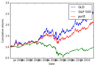
Suppose we want to estimate the performance of a portfolio composed of 75% GLD and 25% SPY? We can approximate the daily returns in an equation as follows:
portfolio_daily_rets = 0.75 * GLD_daily_rets + 0.25 * SPY_daily_rets
Then, using the equation above for cumulative daily returns, we can plot the performance of the combined portfolio. This also is an assignment in my course, so I don’t list the code for it here.
Answer
As I am lazy, I approximate \(\text{SPX} \approx \text{SPY}\)
Input:
    p_rets = na_rets[:, 3] * 0.25 + na_rets[:, 1] * 0.75
    na_plot_cumul_rets = daily_cum_ret(np.concatenate([na_rets[:, [1, 3]], p_rets[:, np.newaxis]], axis=1))

    plt.clf()
    plt.plot(ldt_timestamps, na_plot_cumul_rets)
    plt.legend(["GLD", "S&P 500", "portf."])
    plt.ylabel('Cumulative returns')
    plt.xlabel('Date')
Output:
<matplotlib.text.Text at 0x5c08350>
Exercise: Line fit to Daily Returns
Finally, we revisit the scatterplots above that reveal visually how closely correlated (related) the daily movement of two stocks are. It’s even better if can quantify this correlation by fitting a line to them using linear regression. Note the red line in the figure on the right; this was computed using one of NumPy’s linear regression tools. The value of the slope of the line is reported as “corr” which is technically not correct.
Wikipedia has a nice discussion of correlation.
Again, I’m not going to show the code here, but I will tell you that the code is not very complex, and I used the following functions: polyfit(), polyval(), and sort().
Answer
Note that there is no figure on the wiki. So I choose to fit the XOM scatterplot. I also don’t use the same functions as the instructor, but my version works too.
Input:
    spx_rets, xom_rets = na_rets[:, 3], na_rets[:, 4]
    coefs = np.polyfit(x=spx_rets, y=xom_rets, deg=1)
    fit_f = np.poly1d(coefs)
    fit_x = [np.amin(spx_rets), np.amax(spx_rets)]
    fit_y = fit_f(fit_x)

    plt.clf()
    plt.scatter(spx_rets, xom_rets, c='blue')
    plt.plot(fit_x, fit_y, c='red')
    plt.ylabel('XOM')
    plt.xlabel('$SPX')
Output:
<matplotlib.text.Text at 0x5e701d0>
